APARTMENT IN NEW YORK
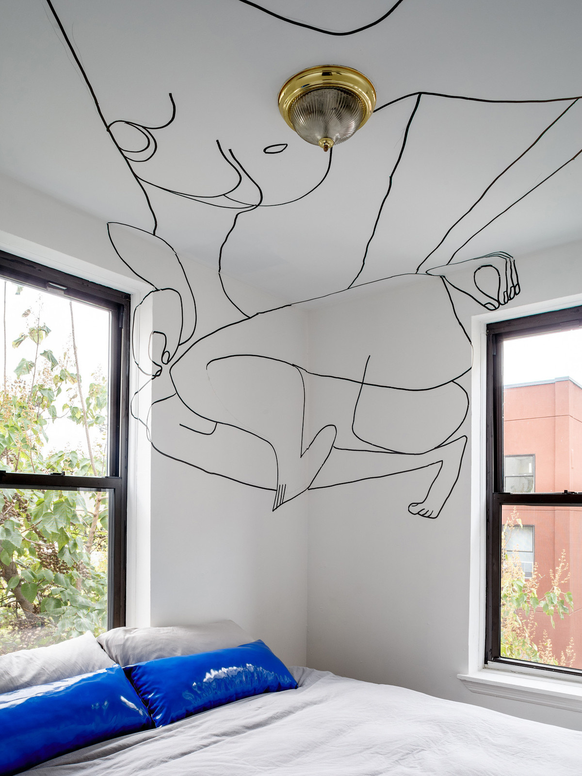
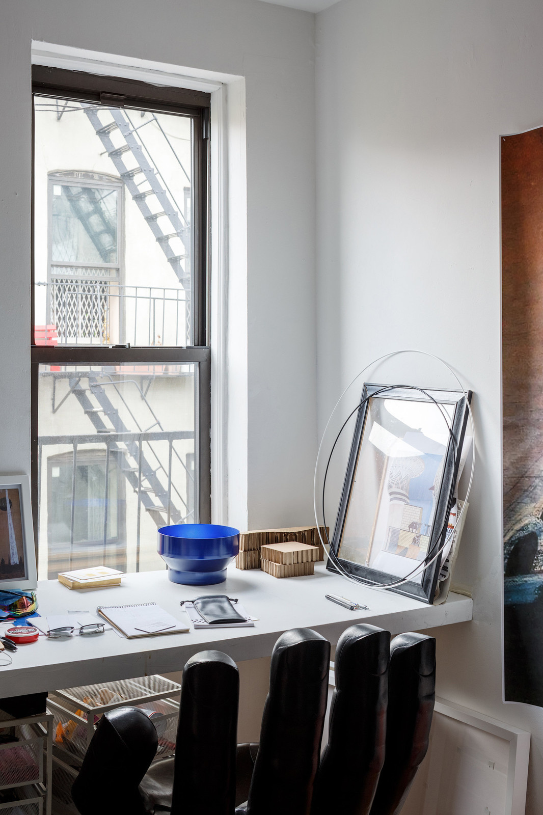
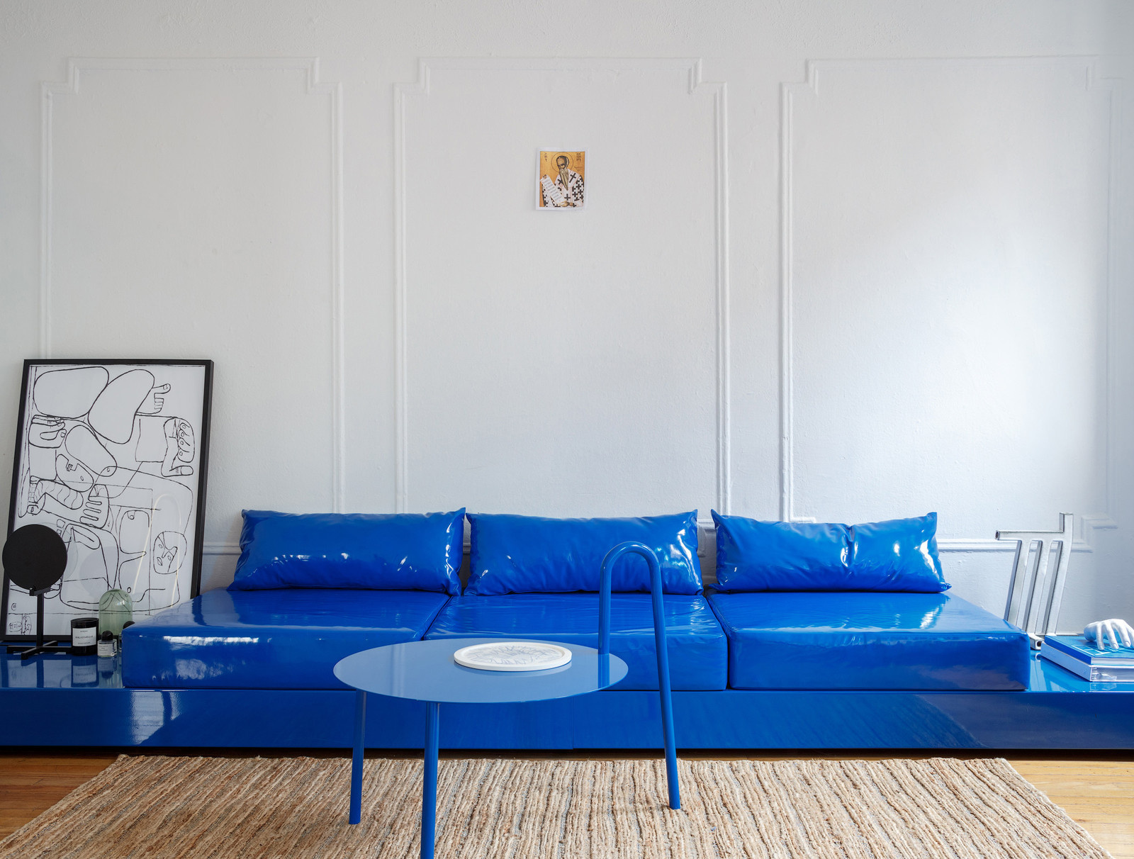
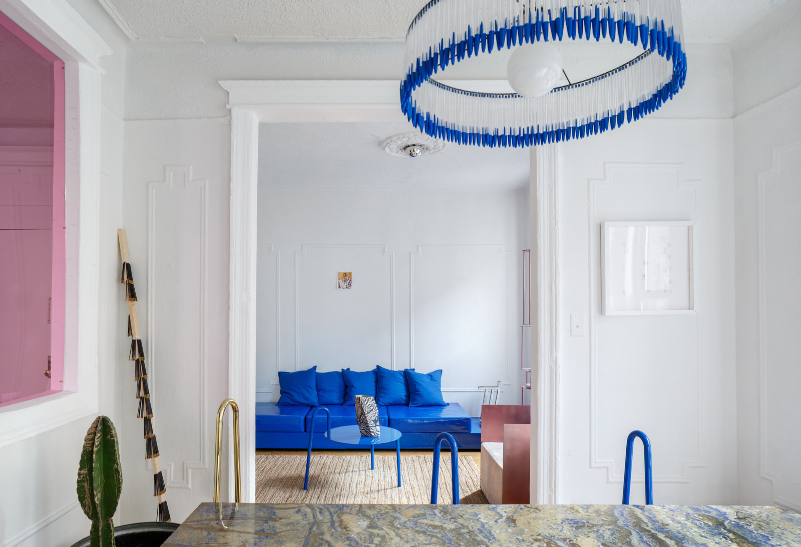
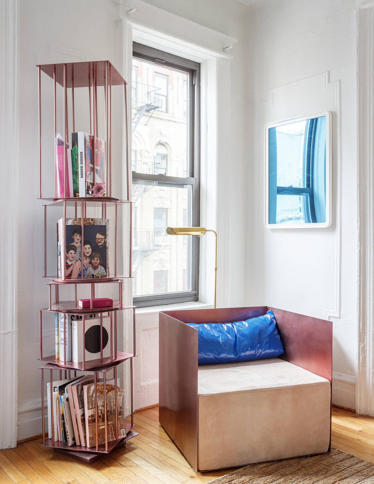
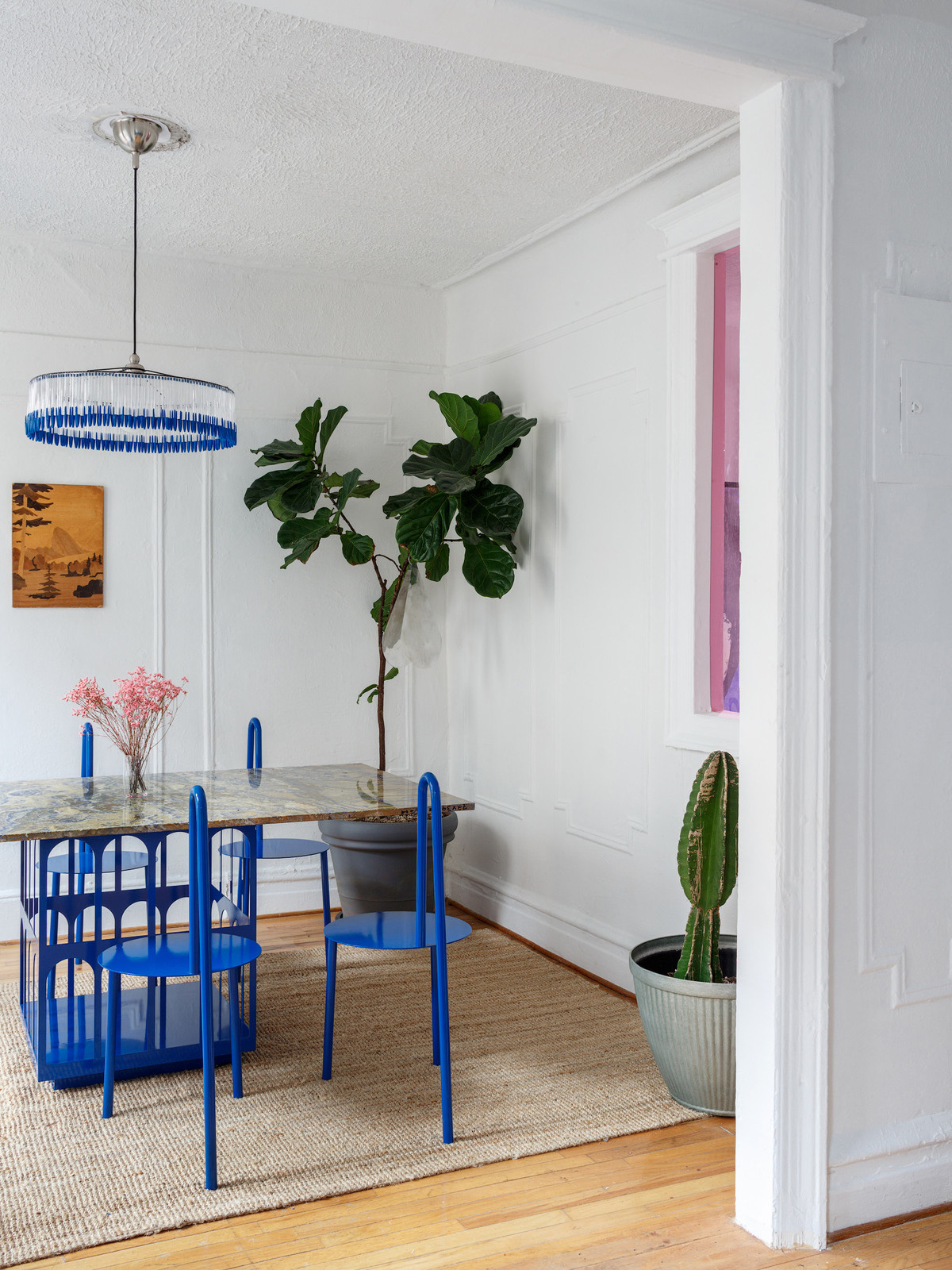
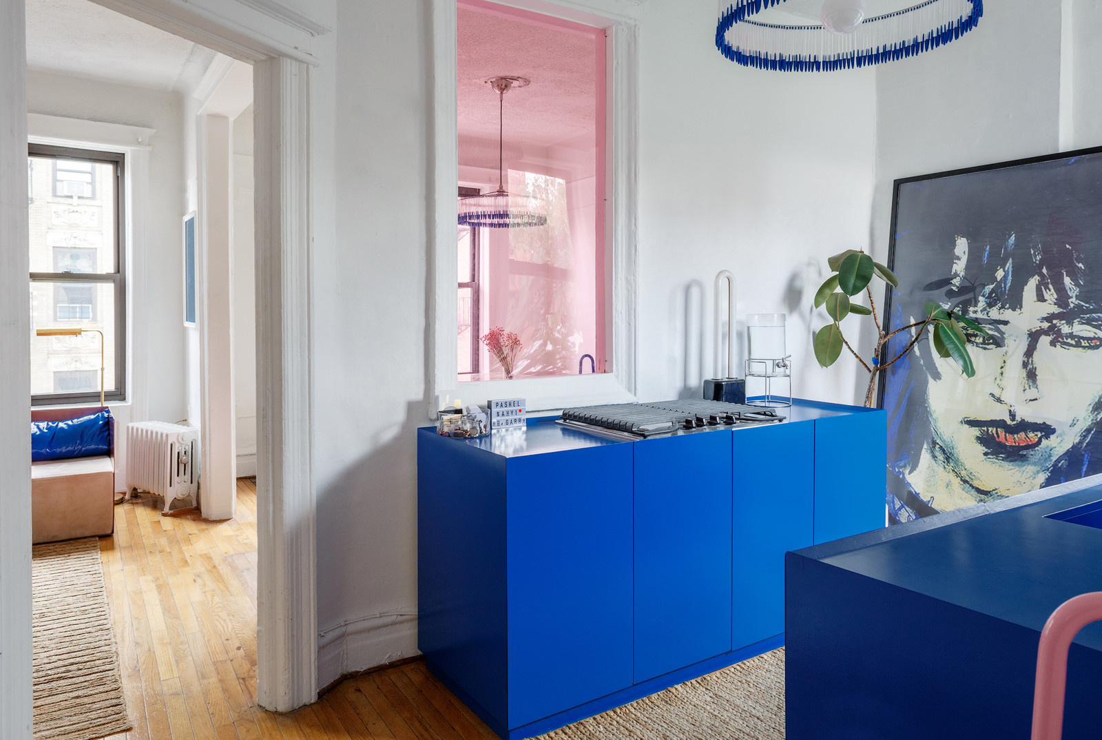
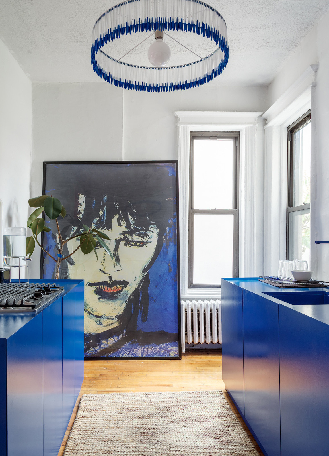
When you step into Harry Nuriev’s Williamsburg apartment, which also serves as the headquarters of his furniture company, Crosby Studios, you see blue: a saturated, deep shade, somewhere between electric and royal. The kitchen cabinets, counters, and faucet are blue, and the long, low sofa is blue vinyl on a powder-coated base. On a coffee table in the living room, a ceramic dish with a pattern of azure crayon scrawls holds candies the color and shape of robin’s eggs. When Nuriev invited me to take one, I thought they were chalk or hard pastels. But when I bit through the candy shell, it tasted like butterscotch. . . Being in an apartment designed by Nuriev is an all-encompassing experience: his knack for detail unites each element, down to the plate of trompe l’oeil candy. “In my space, I feel that people speak differently. They think differently,” Nuriev told me. “I just try to present them with a comfort zone.” . . The apartment was designed when Nuriev was making furniture predominantly in his particular shade of blue (although his commissioned work comes in many shades). It appears throughout: in a cerulean-veined marble tabletop, sourced from New Jersey; loop-backed chairs; and the low vinyl-and-metal sofa, whose trickiest production challenge was matching the fabric to the hue of the powder coating. A chandelier of cobalt Bic pens was inspired by high-school exams. There’s a huge poster of Russian-Korean pop star Viktor Tsoi in the kitchen, chosen for its blue backdrop: when I asked if Nuriev is a fan, he answered, “I’m not, actually, he’s just the icon of an entire generation.” . . Speaking of icons, a small image of a Russian Orthodox saint watches over the living room, found in Greenpoint (“I like the color”). There are subtle references to Nuriev’s heritage throughout the space: there are metal sculptures shown at Design Miami inspired by folk designs and developed with Russian tinsmiths, and a brass carousel bookcase that evokes the speculative skyscrapers of Russian Constructivism. In the dining room hangs a particular kind of wood cutout landscape that has now become a rarity in Russia, but “before, it was in every single office.” . . Nuriev is busy, with six upcoming shows this year. His next is this April, at the Dallas Contemporary. And after his year-long Blue Period, he’s moving on to his next creative phase: he pulled out a swatch of plush, purple velvet to give me a preview. It's an amethyst shade he compared to Rihanna’s Fenty Beauty lilac lipstick and the sofas in Marina Abramović’s New York apartments. (It’s also a fitting choice for the Year of Ultra Violet.) When I asked what he associated with the hues, Nuriev told me, “Blue is very strong and protective. Purple is more regal.” . . “I have to say that when I was in my pink phase, I was so naive,” he continued. “And pink is very naive.”
Год реализации
2017

8 фотографий